Wednesday, December 15, 2010

Colour Project 4: Final

Untitled

In my art I strive to explore ideas of identity and past grandeur. I am fascinated by the press of time; what has come before us and what we have left behind; items once so important, now cast aside and forgotten.

This project is about that ideal of something forgotten. This massive plant, now almost completely subsumed and wholly forgotten by those who once placed it there and those who relied on it for their livelihood. It stands for decay, a past industrial age, now quietly disintegrating with time.
There is another aspect to it to though, this idea of the factory within the setting. It sits there like a monster simultaneously towering over a part of the landscape and an integral part of it. It is alien and foreign, but also a source of great life that the flora and fauna could not live with out.


- -
One last note: I mentioned this during my critique but I don't really feel as if this is the end of the project. I have had a lot of ideas and I definitely see a lot more work of this kind in my future.

Monday, December 13, 2010

Silkscreen Project 6: Final

Series II

Within a series, there is an inherent sense of commonality and conformity. However, at what point does that begin to break down and where does a series become a collection disparate forms.

This project seeks to explore the conceits of individuality and identity and how disparate elements change and affect said ideas.

Sunday, December 12, 2010

Silkscreen Project 6: Thoughts

For my final project, I had a large number or ideas, inspired mainly by the works of the Dutch painter Piet Mondriaan. I wanted to work within series (as per my previous work in the class) but instead of simply repeating a simple monochromatic form, I was going to print a complicated shape utilizing the primary colours and black.


After talking with my professor, I decided to further expand this project by not only altering the internal colours of the shape, I would also alter the backgrounds to add a further element to the conversation.


Eventually though, after much more sketching and more talking with my professor, I decided to simplify this idea (which had become quite large indeed) and just print a single monochromatic form on an a variety of backgrounds.


In an effort to avoid have a very static project, I devised an organic system for choosing the background colours in which I started with either blue, red, or white and simply kept adding red, blue, or black respectively to the inks so that the colours printed would presumably change over time. Due to the unique problem of the screen drying and my haphazard almost arbitrary approach to the colour changing, the final images that resulted were not static at all but instead full of a wide range of colours, tones, and textures.

Colour Project 4: Thoughts

For my final project for Colour Photography, I wanted to do something that was an extension of my earlier work in the class but also moved in a new direction. The reason for this was that I felt much of my work this semester had suffered from my busy schedule. The combination of being very busy with extracurricular activities and my other class commitments (both in silkscreening and video) meant that I was not able to commit as much time as I wanted to (and probably needed to commit) to the class and as such I haven't been that happy with my work. Based on this, rather than trying to go back on change up a project that I had cobbled together, I decided to instead just go in a new direction, as I thought a breath of fresh air, would breathe some life into this final project, an aspect missing in my other shown work.

After considering a variety of options, I decided that to go with shooting at the abandoned cement factory near the municipal water treatment facility of my town. I originally took interest in it when I saw the factory in one of my professor's photographs, but later visited the site and became fascinated with it. Nestled in the trees off a private road and almost entirely hidden from view unless you are almost on top of it, the factory is a monolith of a bygone age. Its aged signs, rusted parts, and highly suspect structural stability construct a fascinating portrait of abandonment mixed with nostalgic past; there is an oddly melancholic beauty to the entire scene.

The shoot itself was moderately successful, shooting on medium format after a long hiatus back to 35mm was really nice and I think that the pictures, though I did not have long to spend wandering about, were well chosen and well representative of the space. I do wish that I had had more time, or an assistant but as I was on a tight schedule, a few miles trek through wind and snow and trespassing, I am still happy with what I was able to do. Being at the factory again –the last time I was there was the spring– was an interesting experience and I have a lot of ideas for stuff to shoot in the future, but for now, I just have to see where to go with what I shot

Sunday, November 28, 2010

Silkscreen Project 4b: Reprint

Circles and Bars II

Much in the same way that I felt unhappy with my previous version of my 2-colour print, I also decided to reprint and improve my 3-colour project.

The only real changes I made were to the inks, the colours of which I darkened slightly and the consistency of which I thinned down. Unfortunately, while I did find myself having more success that previously, I do not view this project as anything more than a study and a exercise in technical reproduction.

Thanksgiving Break

For my Thanksgiving break, I decided to not go anywhere but instead work on what I saw as uncompleted or unsuccessful projects. During this time I reprinted both my third project (the 2-colour print) and my fourth project (the 3-colour print). I also logged a large number or hours doing cosmetic surgery on my fifth project (the poster project). Many of the posters were missing elements/had miss-printings which I decided to go back through all 46 of which I liked best and touch up by hand.

All-in-all I must have spent approximately 6-10 hours a day in the silkscreen studio over the break, but I really got a lot of practice in on the finer points of screen printing and I think it was well worth the effort.

Saturday, November 27, 2010

Silkscreen Project 3b: Reprint

As I was unhappy with my previous attempt with this project, I decided to reprint the entire thing with a few changes made.

The main change is I decided to print the positive forms of the shapes rather than their negatives (which had actually been my original idea). I felt this allowed for a more interesting and successful dialogue between the elements. I also chose to change the colours slightly in an attempt to print them more cleanly and successfully.

Monday, November 22, 2010

Silkscreen Project 5: Poster

For this project, we were tasked as a class to each create a run of posters for a real event, specifically fifty in number, that were to be hung around campus. As a member of the students administrators for Spiral, Oberlin's genre fiction literary magazine, I decided to make posters for their spring semester general interest meeting.

In the design of my poster, I wanted to create something that was subdued in character; that evoked a more refined sensibility (as Spiral is often seen as a less serious, less professional magazine). Because of this I chose the greys, white, and black, as I felt they are often seen as clean colours; they draw attention but are not loud. I chose to print the background as I did and the specific fonts for a related reason. The uneven edges of the background I felt looked somewhat like a page torn from a notebook and the fonts were chosen as I felt they were somewhat reminiscent of those of a typewriter, what has become one of the most iconic symbols of highbrow literaryism.

Finally, in an quasi-ironic send off to all the ideals I tried to cultivate with the rest of the poster and to emphasise the idea that Spiral is not your generic literary magazine, I created the font-art word at the top, which I though added a sense of quirky dynamism to the otherwise rigid, mostly static piece.

Sunday, November 21, 2010

Colour Project 3: Staged Narrative

Shift in Focus

At one point in your life sitting half-naked in a hallway is your morning ritual, but fast forward a few years and for many that is replaced by the newspaper. These images explore various habits we develop in college and what they often will become when we leave and start out real 'professional lives,' the juxtaposition of the two speaks to what we find important at a certain time and how our focus changes.


Wednesday, November 10, 2010

Colour Project 3: Thoughts

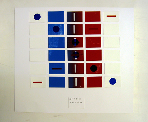
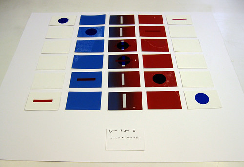
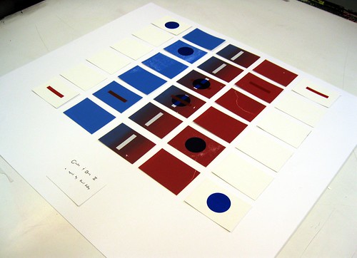
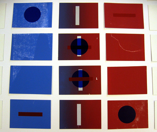
Unsatisfied with my last project, I decided to try (for this project) to again move out of my comfort zone and try working, not only with an assistant, but also with models and in a specified setting.

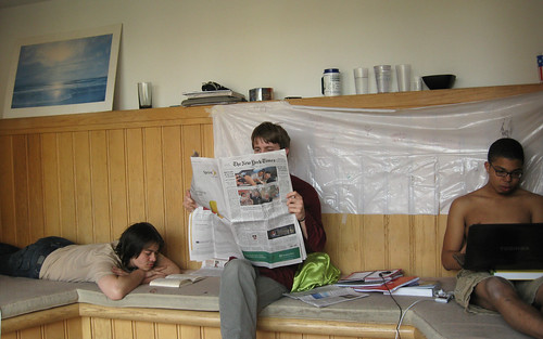
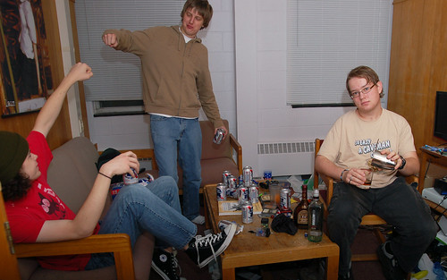
My original idea was to work within the confines of temporal juxtaposition to address the issues of identity and habitual norms in the context of college life and outside of it. I was going to stage, what to me was stereotypical or commonplace moments of college life in setting and scene and place within those images a figure that I manufactured a out of a post-collegiate context. My inspiration for this project came to me in the image of five or six college students sitting around a messy quad uproariously drinking PBR while a lone figure in nice clothing stood in the background mixing themself a strong drink in a shaker amongst assorted top shelf alcohols. The title for this image was taken from the popular DJ Kicken Song "Ain't No Party Like an Alcoholic Party," which speaks to the concept of an alcoholic party versus a party where alcohol is present and also what constitutes a night of drinking in college and what is one post-graduation.

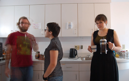
However, after presenting this image and some others (a stack of Starbucks Doubleshot cans next to a French press and a bag of Kona cofee and the image of three people in a communal shower, two of whom were naked and the other clothed in a bathrobe, hairnet, and flip flops) and my general ideas about the project to the class, they brought up a lot of things that had previously not occurred to me. As opposed to the juxtaposition between in versus out of college, they drew my attention a lot to the ideas of class and, in my case, the differences in taste and lifestyle in the Unites States (the home of many of my classmates) and in Europe (where I ostensibly 'grew up'). They also confirmed my suspicion that my third image (in the shower) was not really relevant to my chosen topic.

As class was really not what I was going for at all, I decided to return to my project and try to brainstorm some more about how I could eliminate these and focus in on this idea of temporal juxtaposition. Interestingly enough, through this exploration, I started to think more and more about my sense of identity as an individual and how this project was about not just the temporal college-to-postcollege shift, but also the cultural shift as well.

Monday, November 8, 2010

Silkscreen Project 4: 3-Colour Project

Within the project I attempted to explore quality of reproduction, for which silkscreening is most commonly used. My idea was to create posters for a fictitious company that offered mass-produced "personalised gifts" for a variety of [Christian/American] holidays. These would then be displayed in a huge 4x4 grid on a wall to amplify the crass overwhelming, if not claustraphobic nature of the posters.

When creating this project, I was thinking about ideas of commercialisation, what I see as the ever-increasing laziness/detachment of the general public, and the narrow-minded majority-centric ideals that drive a lot of holiday cheer/celebrations in the United States.

Unfortunately, as you will see below, I have still not mastered the art of silkscreening as reproduction and so I do not view this project as complete, but more or a study in reproduction/learning experience concerning the technicalities of printing.

Sunday, October 31, 2010

Fall Break

During my fall break this year, I decided to go visit my family for first break in a few years. I first met up with them in Cleveland and we all went to see one of my cousins get married in Harkness Chapel located on the Case Western Reserve campus, which I brought along a camera and decided to shoot.
After this, we all traveled back to where the reside now, in Houston, TX, having moved this summer. I then spent a few days there and during which I traveled up to San Antonio to visit my friend who is going to school at Trinity University, located there.
The photos below appear off colour because I decided to, rather than use the nice professional film I have been shooting on recently (Fujifilm Pro 160 S and Kodak Portra 160 NC), to use some Kroger brand film that I found when I purchased my last 35mm cameras - the discolouration is due to the fact that it expired in 1999. The reason that I decided to do so is that I find the false colour readings that often come with shooting on expired film/printing on expired paper are very interesting and often surreal/nostalgic, ideas I thought appropriate for weddings. Once I left the wedding though, I thought that since I had started anyway, I might as well try to finish off rest of Kroger rolls, which I shot while back in Texas

Wednesday, October 20, 2010

Colour Project 2: Sense of Place

Spaces

To people, the edifices that surround us form a kind of visual white noise. Not only are they iconic in our landscapes, but in no small way do they also become integral to, if not the entirety of, the landscapes as well.


Monday, October 18, 2010

Silkscreen Project 3: 2-Colour Print

Circles and Bars

With this project, I decided to continue my exploration of 'repetition of form' that I started in my previous silkscreen project. I don't really see this piece as very resolved or even well produce by more of a study in both technique and concept.

The overarching idea behind this exercise was to examine the tension created from between the interactions inherent in the piece. The main source of tension was between colours: white, red, and blue (all very basic and unadulterated, used straight from the manufactures inks) and how they interact with each other and the negative space of the white card stock. This was further complicated by their depictions in the simple geometric forms of the rectangle and circle and how these shapes are used to create a certain phasing that happens within the piece.

IMG_0578ed

Monday, October 4, 2010

Silkscreen Project 2: B/W Project

Series I

Many people in my class are accomplished drawers, sketchers, and/or painters but as I am not by any stretch of the imagination, I decided to instead concentrate on something I could make; on form rather than illustration. What this eventually turned out to be was a collection of 14 lines that came to me while I was musing about what to make.

The lines are separate into four groups (2-4-5-3) and together form a semi-cohesive figure that is curved on one side and straight on the other. What I tried to do with this was to print the image both singularly and layered upon itself multiple times to express how duplication of the images through silkscreening could take one simplistic shape and create a whole host of unique objects.


Unfortunately, as I am an not a very good printer, they prints did not come out perfectly clear as I have originally intended. Because of this, the project has also developed a second aspect; not only is it exploration of how duplication and scale can change an image, but also how my imperfect grasp of the process contributes to the creation of imperfect images whose degradation also add to the concept of the unique image.

Monday, September 27, 2010

Silkscreen Project 1: Experimenting

For our first project, we were tasked to use the printing processes* that we have learned thus far to create something. We were told to 'not try and make art' but instead experiment and try to get a handle on the various techniques available to us. We could use any colour of ink (it was requested that we only use one though) and any stock/material to print on.

*Processes:
Paper stencils
Drawing fluid
WD Filler
Sta-Sharp Adhering Fluid / Cut Film.

For my image, I decided to divide my canvas into four separate squares. In the top two I created a stencil with the cut film, and for the bottom half I draw images with the drawing fluid, one of which I took the negative of my painting over it with WD Filler and then rinsing the screen.

My original plan was to simply print one colour on a variety of media (cougar white paper stock and newsprint) but after trying a few runs, I decided to mix things up; this is what I ended up with.