Sunday, October 31, 2010

Fall Break

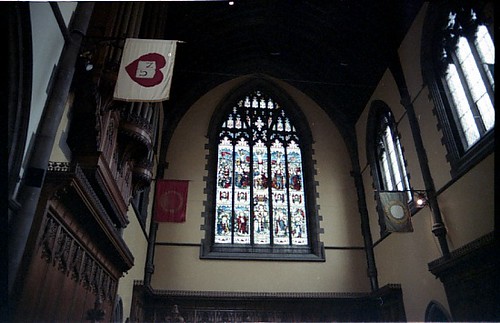
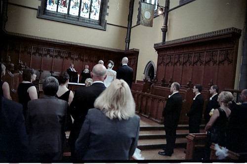
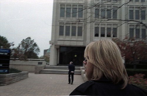
During my fall break this year, I decided to go visit my family for first break in a few years. I first met up with them in Cleveland and we all went to see one of my cousins get married in Harkness Chapel located on the Case Western Reserve campus, which I brought along a camera and decided to shoot.
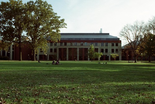
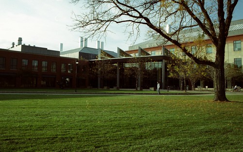
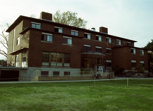
After this, we all traveled back to where the reside now, in Houston, TX, having moved this summer. I then spent a few days there and during which I traveled up to San Antonio to visit my friend who is going to school at Trinity University, located there.
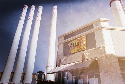
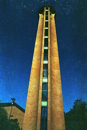
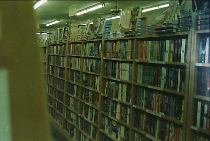
The photos below appear off colour because I decided to, rather than use the nice professional film I have been shooting on recently (Fujifilm Pro 160 S and Kodak Portra 160 NC), to use some Kroger brand film that I found when I purchased my last 35mm cameras - the discolouration is due to the fact that it expired in 1999. The reason that I decided to do so is that I find the false colour readings that often come with shooting on expired film/printing on expired paper are very interesting and often surreal/nostalgic, ideas I thought appropriate for weddings. Once I left the wedding though, I thought that since I had started anyway, I might as well try to finish off rest of Kroger rolls, which I shot while back in Texas

Wednesday, October 20, 2010

Colour Project 2: Sense of Place

Spaces

To people, the edifices that surround us form a kind of visual white noise. Not only are they iconic in our landscapes, but in no small way do they also become integral to, if not the entirety of, the landscapes as well.


Monday, October 18, 2010

Silkscreen Project 3: 2-Colour Print

Circles and Bars

With this project, I decided to continue my exploration of 'repetition of form' that I started in my previous silkscreen project. I don't really see this piece as very resolved or even well produce by more of a study in both technique and concept.

The overarching idea behind this exercise was to examine the tension created from between the interactions inherent in the piece. The main source of tension was between colours: white, red, and blue (all very basic and unadulterated, used straight from the manufactures inks) and how they interact with each other and the negative space of the white card stock. This was further complicated by their depictions in the simple geometric forms of the rectangle and circle and how these shapes are used to create a certain phasing that happens within the piece.

IMG_0578ed

Monday, October 4, 2010

Silkscreen Project 2: B/W Project

Series I

Many people in my class are accomplished drawers, sketchers, and/or painters but as I am not by any stretch of the imagination, I decided to instead concentrate on something I could make; on form rather than illustration. What this eventually turned out to be was a collection of 14 lines that came to me while I was musing about what to make.

The lines are separate into four groups (2-4-5-3) and together form a semi-cohesive figure that is curved on one side and straight on the other. What I tried to do with this was to print the image both singularly and layered upon itself multiple times to express how duplication of the images through silkscreening could take one simplistic shape and create a whole host of unique objects.


Unfortunately, as I am an not a very good printer, they prints did not come out perfectly clear as I have originally intended. Because of this, the project has also developed a second aspect; not only is it exploration of how duplication and scale can change an image, but also how my imperfect grasp of the process contributes to the creation of imperfect images whose degradation also add to the concept of the unique image.