Sunday, November 28, 2010

Silkscreen Project 4b: Reprint

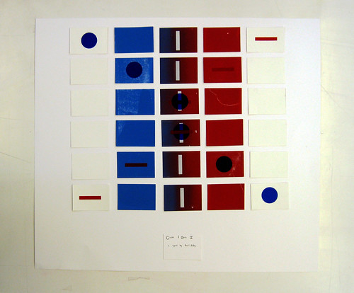
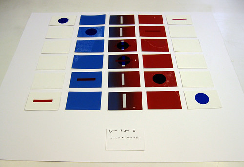
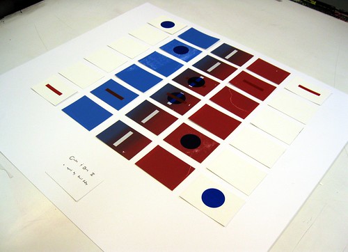
Circles and Bars II

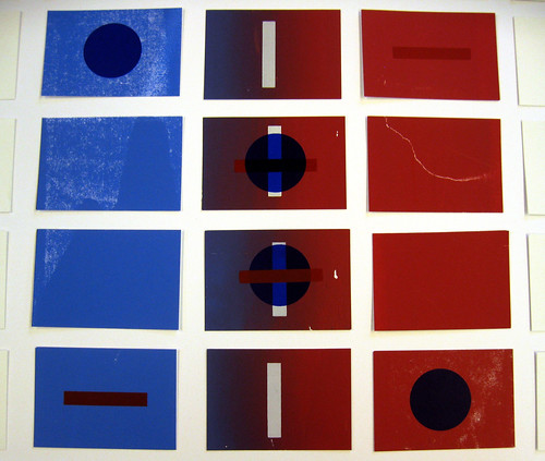
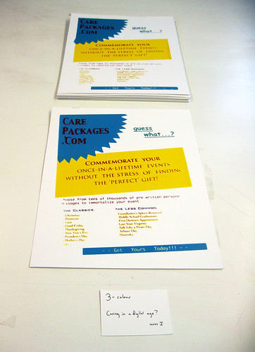
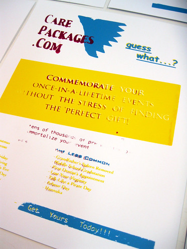
Much in the same way that I felt unhappy with my previous version of my 2-colour print, I also decided to reprint and improve my 3-colour project.

The only real changes I made were to the inks, the colours of which I darkened slightly and the consistency of which I thinned down. Unfortunately, while I did find myself having more success that previously, I do not view this project as anything more than a study and a exercise in technical reproduction.

Thanksgiving Break

For my Thanksgiving break, I decided to not go anywhere but instead work on what I saw as uncompleted or unsuccessful projects. During this time I reprinted both my third project (the 2-colour print) and my fourth project (the 3-colour print). I also logged a large number or hours doing cosmetic surgery on my fifth project (the poster project). Many of the posters were missing elements/had miss-printings which I decided to go back through all 46 of which I liked best and touch up by hand.

All-in-all I must have spent approximately 6-10 hours a day in the silkscreen studio over the break, but I really got a lot of practice in on the finer points of screen printing and I think it was well worth the effort.

Saturday, November 27, 2010

Silkscreen Project 3b: Reprint

As I was unhappy with my previous attempt with this project, I decided to reprint the entire thing with a few changes made.

The main change is I decided to print the positive forms of the shapes rather than their negatives (which had actually been my original idea). I felt this allowed for a more interesting and successful dialogue between the elements. I also chose to change the colours slightly in an attempt to print them more cleanly and successfully.

Monday, November 22, 2010

Silkscreen Project 5: Poster

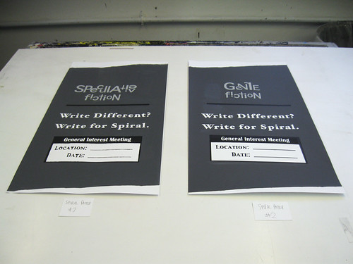
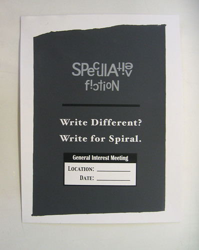
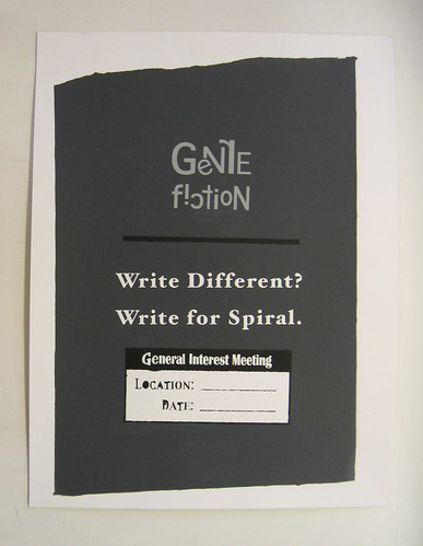
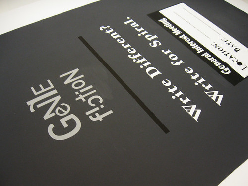
For this project, we were tasked as a class to each create a run of posters for a real event, specifically fifty in number, that were to be hung around campus. As a member of the students administrators for Spiral, Oberlin's genre fiction literary magazine, I decided to make posters for their spring semester general interest meeting.

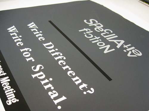
In the design of my poster, I wanted to create something that was subdued in character; that evoked a more refined sensibility (as Spiral is often seen as a less serious, less professional magazine). Because of this I chose the greys, white, and black, as I felt they are often seen as clean colours; they draw attention but are not loud. I chose to print the background as I did and the specific fonts for a related reason. The uneven edges of the background I felt looked somewhat like a page torn from a notebook and the fonts were chosen as I felt they were somewhat reminiscent of those of a typewriter, what has become one of the most iconic symbols of highbrow literaryism.

Finally, in an quasi-ironic send off to all the ideals I tried to cultivate with the rest of the poster and to emphasise the idea that Spiral is not your generic literary magazine, I created the font-art word at the top, which I though added a sense of quirky dynamism to the otherwise rigid, mostly static piece.

Sunday, November 21, 2010

Colour Project 3: Staged Narrative

Shift in Focus

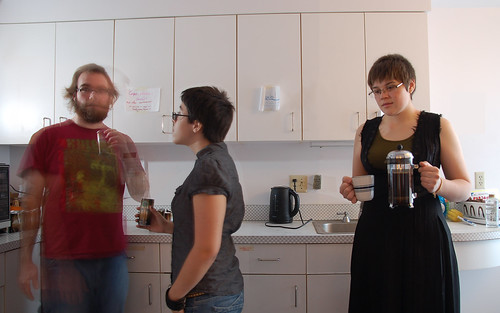
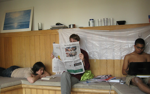
At one point in your life sitting half-naked in a hallway is your morning ritual, but fast forward a few years and for many that is replaced by the newspaper. These images explore various habits we develop in college and what they often will become when we leave and start out real 'professional lives,' the juxtaposition of the two speaks to what we find important at a certain time and how our focus changes.


Wednesday, November 10, 2010

Colour Project 3: Thoughts

Unsatisfied with my last project, I decided to try (for this project) to again move out of my comfort zone and try working, not only with an assistant, but also with models and in a specified setting.

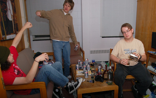
My original idea was to work within the confines of temporal juxtaposition to address the issues of identity and habitual norms in the context of college life and outside of it. I was going to stage, what to me was stereotypical or commonplace moments of college life in setting and scene and place within those images a figure that I manufactured a out of a post-collegiate context. My inspiration for this project came to me in the image of five or six college students sitting around a messy quad uproariously drinking PBR while a lone figure in nice clothing stood in the background mixing themself a strong drink in a shaker amongst assorted top shelf alcohols. The title for this image was taken from the popular DJ Kicken Song "Ain't No Party Like an Alcoholic Party," which speaks to the concept of an alcoholic party versus a party where alcohol is present and also what constitutes a night of drinking in college and what is one post-graduation.

However, after presenting this image and some others (a stack of Starbucks Doubleshot cans next to a French press and a bag of Kona cofee and the image of three people in a communal shower, two of whom were naked and the other clothed in a bathrobe, hairnet, and flip flops) and my general ideas about the project to the class, they brought up a lot of things that had previously not occurred to me. As opposed to the juxtaposition between in versus out of college, they drew my attention a lot to the ideas of class and, in my case, the differences in taste and lifestyle in the Unites States (the home of many of my classmates) and in Europe (where I ostensibly 'grew up'). They also confirmed my suspicion that my third image (in the shower) was not really relevant to my chosen topic.

As class was really not what I was going for at all, I decided to return to my project and try to brainstorm some more about how I could eliminate these and focus in on this idea of temporal juxtaposition. Interestingly enough, through this exploration, I started to think more and more about my sense of identity as an individual and how this project was about not just the temporal college-to-postcollege shift, but also the cultural shift as well.
Monday, November 8, 2010

Silkscreen Project 4: 3-Colour Project

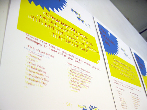
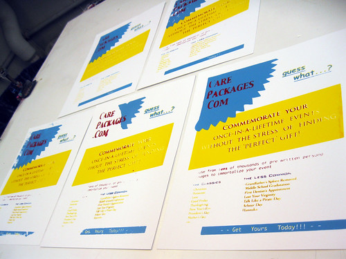
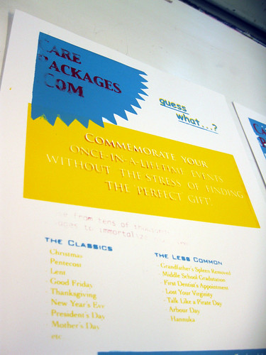
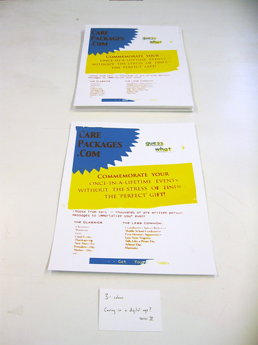
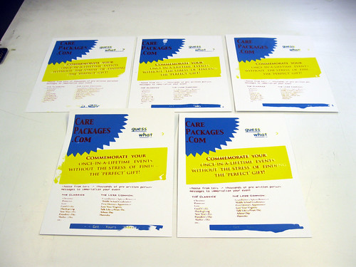
Within the project I attempted to explore quality of reproduction, for which silkscreening is most commonly used. My idea was to create posters for a fictitious company that offered mass-produced "personalised gifts" for a variety of [Christian/American] holidays. These would then be displayed in a huge 4x4 grid on a wall to amplify the crass overwhelming, if not claustraphobic nature of the posters.

When creating this project, I was thinking about ideas of commercialisation, what I see as the ever-increasing laziness/detachment of the general public, and the narrow-minded majority-centric ideals that drive a lot of holiday cheer/celebrations in the United States.

Unfortunately, as you will see below, I have still not mastered the art of silkscreening as reproduction and so I do not view this project as complete, but more or a study in reproduction/learning experience concerning the technicalities of printing.