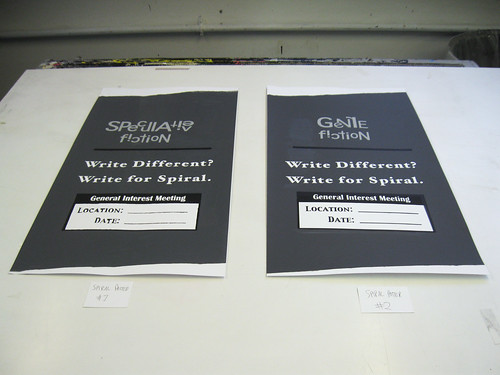
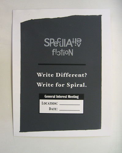
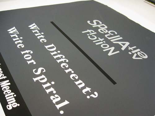
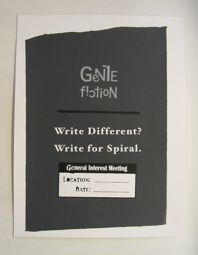
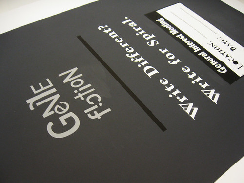
In the design of my poster, I wanted to create something that was subdued in character; that evoked a more refined sensibility (as Spiral is often seen as a less serious, less professional magazine). Because of this I chose the greys, white, and black, as I felt they are often seen as clean colours; they draw attention but are not loud. I chose to print the background as I did and the specific fonts for a related reason. The uneven edges of the background I felt looked somewhat like a page torn from a notebook and the fonts were chosen as I felt they were somewhat reminiscent of those of a typewriter, what has become one of the most iconic symbols of highbrow literaryism.
Finally, in an quasi-ironic send off to all the ideals I tried to cultivate with the rest of the poster and to emphasise the idea that Spiral is not your generic literary magazine, I created the font-art word at the top, which I though added a sense of quirky dynamism to the otherwise rigid, mostly static piece.
No comments:
Post a Comment