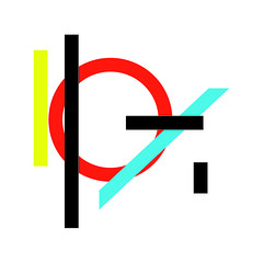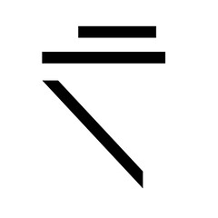
After talking with my professor, I decided to further expand this project by not only altering the internal colours of the shape, I would also alter the backgrounds to add a further element to the conversation.


Eventually though, after much more sketching and more talking with my professor, I decided to simplify this idea (which had become quite large indeed) and just print a single monochromatic form on an a variety of backgrounds.

In an effort to avoid have a very static project, I devised an organic system for choosing the background colours in which I started with either blue, red, or white and simply kept adding red, blue, or black respectively to the inks so that the colours printed would presumably change over time. Due to the unique problem of the screen drying and my haphazard almost arbitrary approach to the colour changing, the final images that resulted were not static at all but instead full of a wide range of colours, tones, and textures.
No comments:
New comments are not allowed.