Monday, September 27, 2010

Silkscreen Project 1: Experimenting

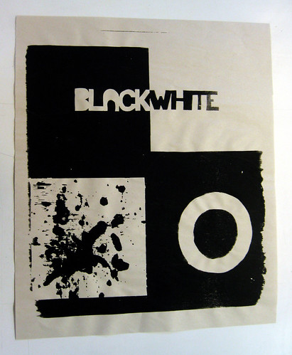
For our first project, we were tasked to use the printing processes* that we have learned thus far to create something. We were told to 'not try and make art' but instead experiment and try to get a handle on the various techniques available to us. We could use any colour of ink (it was requested that we only use one though) and any stock/material to print on.

*Processes:
Paper stencils
Drawing fluid
WD Filler
Sta-Sharp Adhering Fluid / Cut Film.

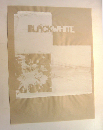
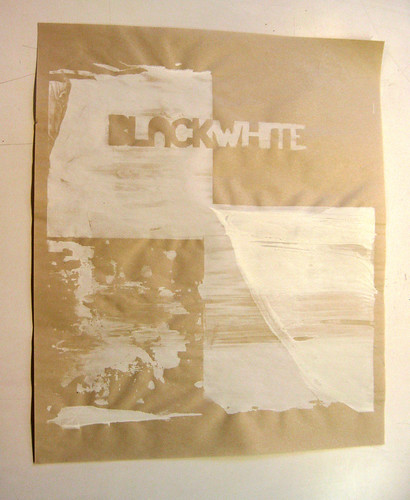
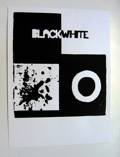
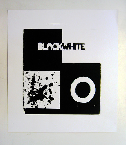
For my image, I decided to divide my canvas into four separate squares. In the top two I created a stencil with the cut film, and for the bottom half I draw images with the drawing fluid, one of which I took the negative of my painting over it with WD Filler and then rinsing the screen.

My original plan was to simply print one colour on a variety of media (cougar white paper stock and newsprint) but after trying a few runs, I decided to mix things up; this is what I ended up with.


Colour Project 1: Rebirth

Phoenix

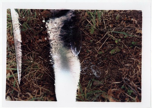
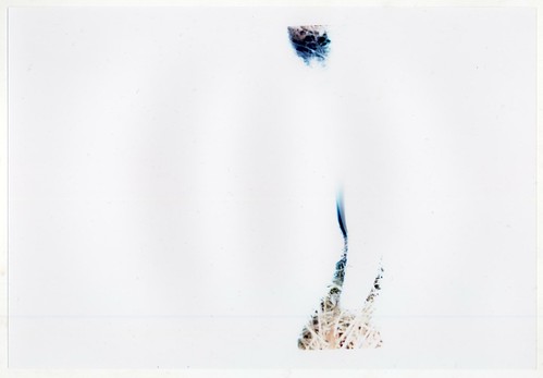
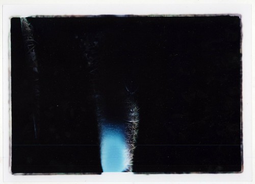
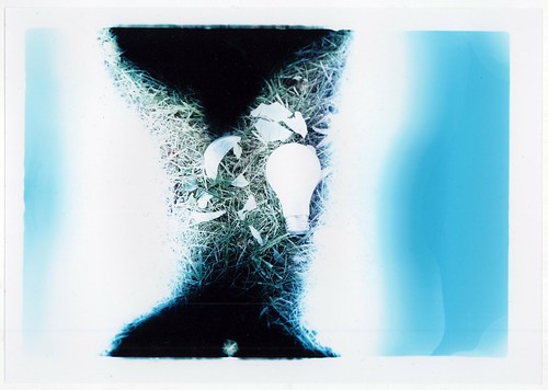
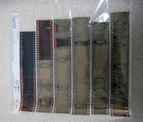
In this project I attempted to print some horribly mangled negatives.
As we seen the disintegration of the original image, false colour and artefacts of the process begin to emerge and thus a new image is born out of the wreckage of another.

/


pr1_3

Wednesday, September 22, 2010

Colour Project 1: Trial 2

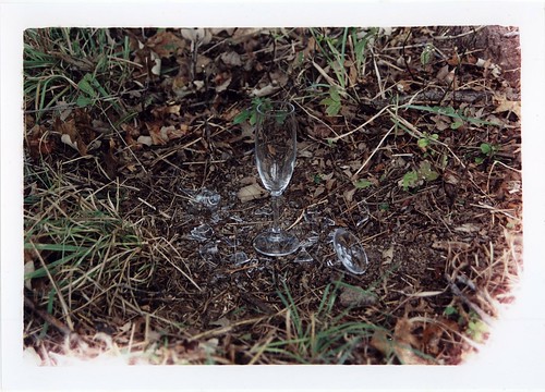
After my initial failure, I decided the best way to re-invigorate the project for myself, I decided to I tried to step out of my comfort zone and buy a bunch of supplies, get an assistant and stage a metaphorical scene with objects, which I choose carefully for their assorted cultural/literary significance.

I took all of my collected objects (2 exact copies of each) and went to a nearby field. I then proceeded to destroy each object in a different manner, the destruction itself I filmed, making the process into somewhat of a performance piece itself. I then placed the mated object (the unbroken twin of the first) into the wreckage and photographed the scene.

Each photo was then going to be labeled with the metaphorical reference that the object was supposed to contain within itself. The point of everything was to speak to the idea that one always can continue on even through trials/hardship and in the wake of the destruction of the a value itself; that in my opinion, human will is insurmountable.

--------------------------------------------------


Unfortunately, after all this planning, preparation, and process, fate through a wrench in the works and while I was developing, the spool on which I loaded my film, fell apart, and thus I developed my negatives as one large chuck, thoroughly ruining them all. As such I had to rethink what I had done, and where I was/could possibly go.

Tuesday, September 14, 2010

Colour Project 1: Trial 1

For our first project, we all wrote words on a strip of paper and three were chosen at random. We then voted on which of those three liked best.
What was eventually chosen was the words Rebirth/Renewal.

After some consideration, I decided that what I wanted to do was to photograph a space over time; specifically, a space waking up. After some consideration of the possibilities, I decided that the best place to shoot this would be in the the Perlick Commons, a glass atrium, with a small cafe-counter, near where I live that is a popular breakfast destination for students. My plan was to show the renewal of both the space (as the sun rose) and the people (as they partook in breakfast).

When I finally went out, I set up at early in the morning, at approximately 7:00 A.M. and was there for 5 hours, (until 12:00 P.M.). My setup was relatively simple; I had two 35mm cameras (a Canon AE-1 and a Minolta X-700) on tripods with one facing towards the counter/door to the atrium and the other into the atrium where the bulk of the people sat. I then took one picture in each camera every ten minutes for a total of 25 images. Through I had to dodge a series of questions about what I was doing (usually pointing to the sign that said time-lapse art project in progress was enough) and defending my little enclave of equipment from the morning hustle and bustle, there were no real problems with the actual process of taking the pictures.

Unfortunately, nothing really worked like I had hoped. The main reason was that I encountered three large, distinct problems.
The first was that my AE-1 has a light leak problem. I had it fixed once, which stopped the issue from being a constant blight but eventually had to buy a new AE-1 due to the potential for ruined negatives. However, that camera was stolen a few months ago and my other 35mm were broken/out of batteries, so it was either run the risk, or no second camera. Some pictures did come out but none were really printable.
The second problem was that I changed the F-stop between shots. I did this thinking that I wanted to make sure that my first images were not under-exposed and the last not over-, essentially entirely for consistency. Unexpectedly, that is exactly the opposite of what I got. Essentially, the short of it is that what I was counting on to show the passage of time was the movement of shadows along the walls and floors as the sun rose, but with the change of the aperture, the shadows were perfectly clear in some, and completely gone in others.
The third problem was really stupid. I forgot to change the ISO on my cameras from 400 (I had been shooting Delta 400 for the past two months) to 160 for my Kodak Portra 160 NC, which meant that a good deal of my film was over exposed.

All in all, I was found the project very interesting conceptually and I did have a good time shooting it but after developing the film, I was very unhappy with what came out, even the images that developed well. Also, the entire process took so long and I didn't really have the time or energy to devote another five hours one morning to reshooting the project so I decided that since it only produced mediocre images anyway. I would shelve this idea away for another time and try to go in a different direction.
Saturday, September 11, 2010

Black/White "Colour" Print

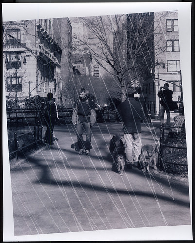
Today in class we were asked to print a B/W negative using the colour process as a way to introduce us to the medium. Fortunately for me, I had already wet my feet in the colour process three semesters before and so it wasn't something that new/difficult to me.

The negative that I choose was incredibly boring and so in an attempt to make a more lively print, I tried to introduce an element of texture into the the print by scratching the negative.

Below is what resulted.

Monday, September 6, 2010

New Semester

This semester I am simultaneously taking two Studio classes at uni.
This is my first true dive into art here/in a long time/ever and I am fairly apprehensive about the prospects as I know the time commitments for both will be sizable and I am not sure if I have significant enough time to put as much into both of them as I would like. I guess all that I can is that we shall see.

The classes I will be taking (and thus the art that will most likely be posted soon are):
ARTS 072: Problems in Colour Photography
ARTS 054: Visual/Processes: Introduction to Silkscreening